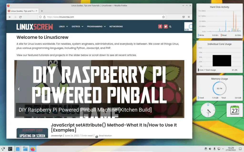
This review will show you what KDE Plasma 5 and KDE Neon look like in 2022, from installation to the desktop, and provide some thoughts on usability and how it stacks up against other GUIs like Gnome and MATE.
What is KDE?
KDE is a Desktop Environment mainly used on Linux systems. It has since grown into a large development communitity working on a variety of desktop software projects including UI frameworks for use with the KDE desktop environment, and a suite of applications including text editors, media players, email cloints, web browsers, and image editors for use on the KDE desktop. KDE are also working on a mobile version of their GUI for use on future handheld devices.
KDE Plasma 5
KDE Plasma 5 is the latest version of the KDE desktop environment for Linux. It has better performance than previous versions, with better OpenGL support for visual effects, and a more consistent experience across devices and screen sizes. The KDE desktop has a focus on usability and familiarity, rather than minimalism.
KDE toutes the following features of its desktop environment:
- Flexible desktops, virtual desktops, and workspaces
- Widgets for displaying information on the desktop
- Extended clipboard functionality with copy/paste history
- Centralised notifications and media control
- Encrypted storage vaults to keep your files safe
- Night mode
- Session management to keep your apps in a consistent state across system reboots
KDE Neon
KDE Neon is an Ubuntu-based Linux distribution that uses KDE Plasma 5 as it’s desktop environment. It’s intended to be a showcase of the latest stable releases of the KDE desktop environment and associated software.
KDN Neon is based on Ubuntu LTS releases, so it will receive security updates for an extended period of time, making it ideal as a daily-driver Linux system.
While I’ve usually stuck to Ubuntu Desktop on my own computers just to keep things compatible (and consistent with what most other people are using when writing tutorials), I really, really dislike using the more recent versions of GNOME – the lack of customisability and lack of functionality really get in the way. Linux Mint’s GUI offerings are a bit better – MATE and XFCE are much better to use, but both provide a slightly inconsistent experience.
I figured it was time to give KDE a look (the last time I used a KDE based distribution was Corel Linux back around the turn of the millenium) to see if it would make a suitable replacement for my current desktop environment.
So, here’s a bunch of screenshots I took, along with my thoughts on the KDE Neon (and Plasma 5) installation experience, and how I found the KDE desktop as a new user.
Installation
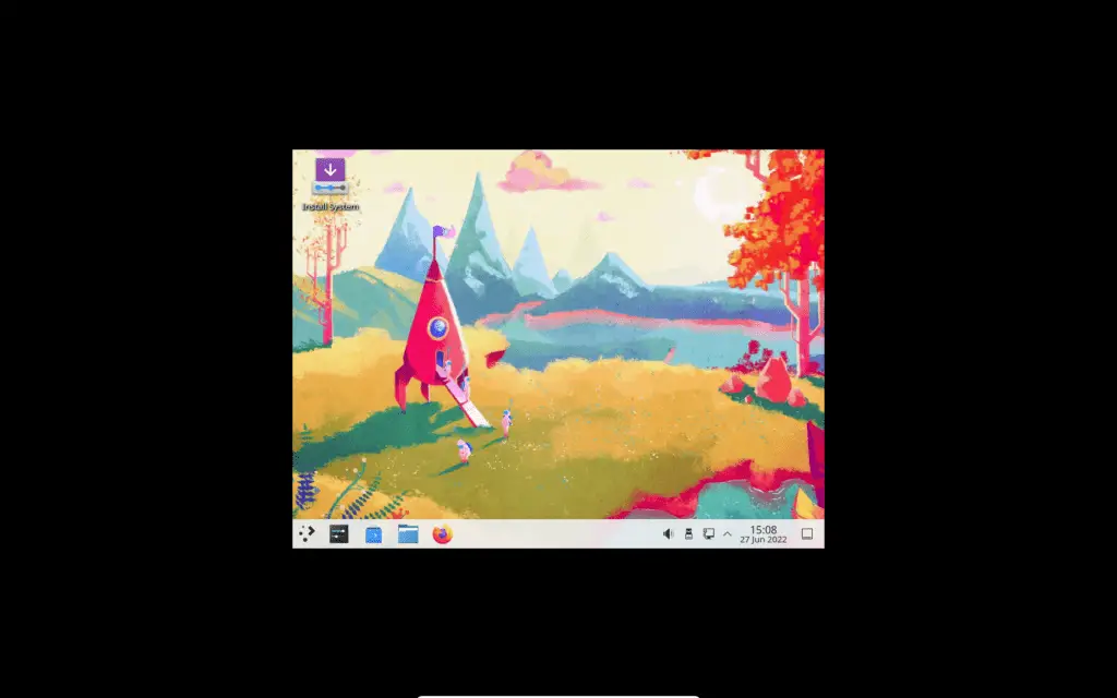
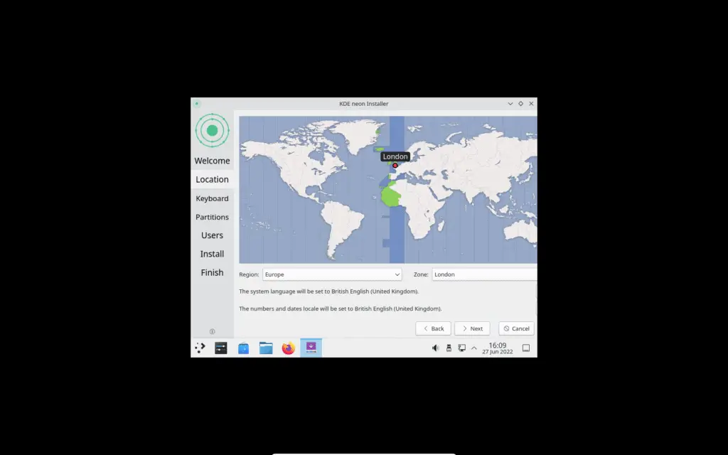
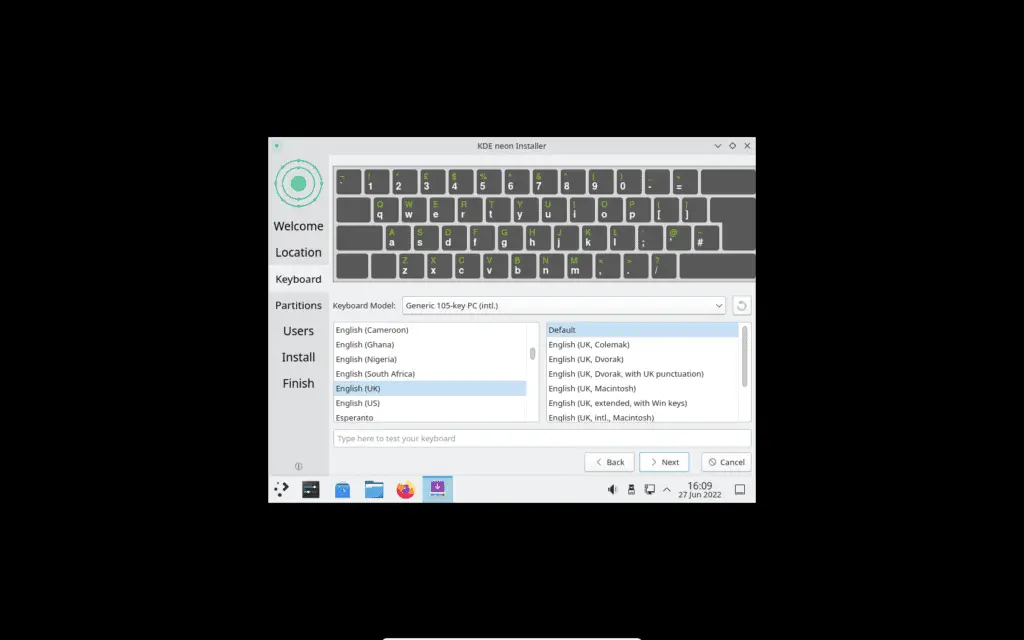
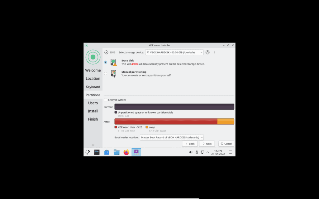
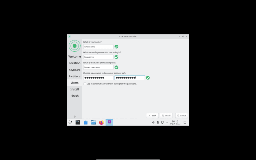
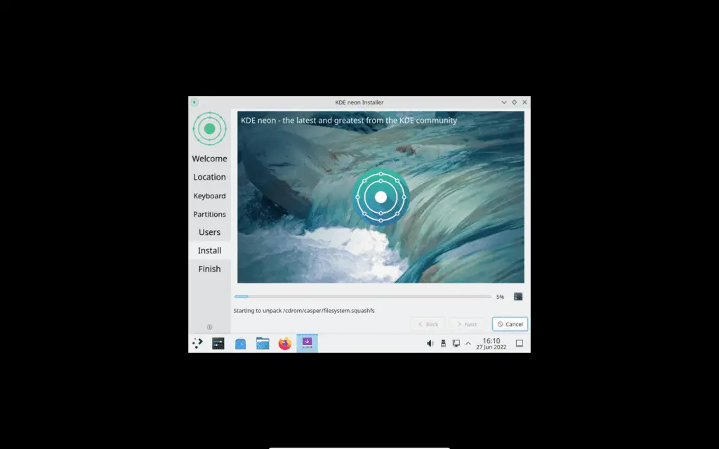
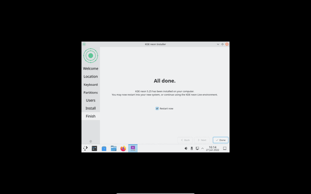
First up, installing KDE Neon. After downloading and booting from the installation disk you can muck around with the KDE desktop without having to install it to your hard disk. This is a bit limited though, so onwards with the installation.
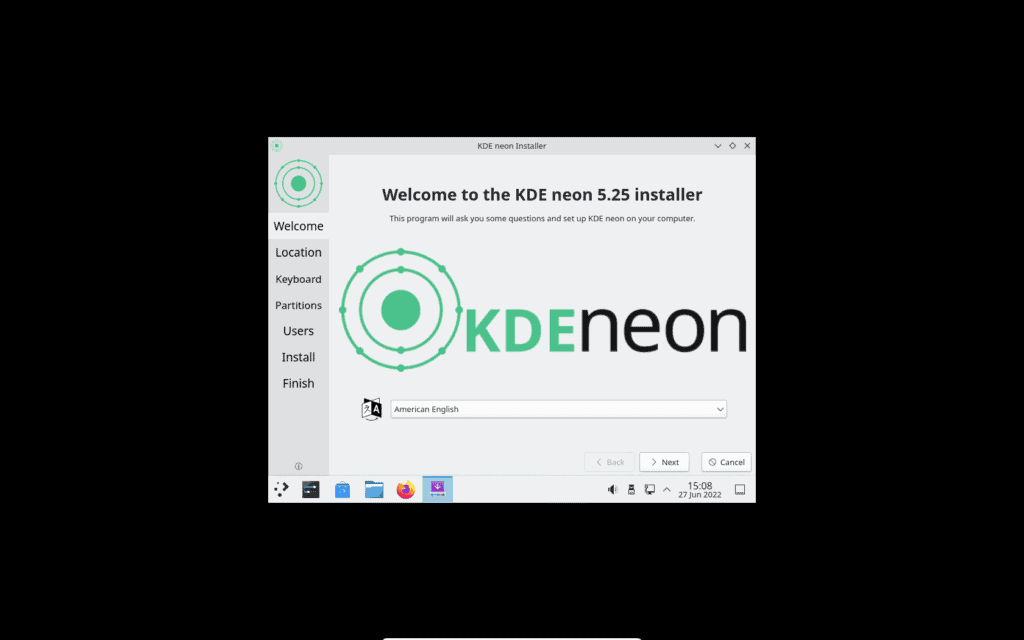
I’ve included screenshots of the installation steps below. The KDE Neon installation process is pretty standard – there are no surprises here compared to installing any other Linux distribution.
The KDE Desktop
The installation is out of the way – time to check out the the KDE desktop properly.
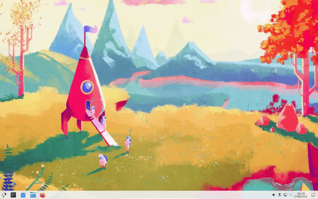
There’s not much to be said about the overall layout and behaviour. If you’ve used a GUI in the last 20 years , you’ll instinctually know your way around. And that’s a good thing – one of my biggest problems with mainstream Ubuntu user interfaces over the last 5 years or so has been the constant attempts to re-invent the wheel. Interestingly, Microsoft are currently attempting the same thing with Windows 11 by moving all of the UI elements around on the screen so that you’re never sure where anything is anymore.
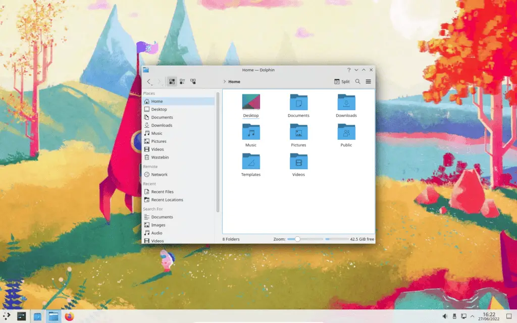
KDE keeps things standard – a menu in the bottom left corner, running apps and docked icons in the taskbar, and icons on the desktop. You can of course customise things as you like, but the default esperience will be familiar and immediately usable to users coming from other operating systems and desktop environments.
KDE Desktop Configuration
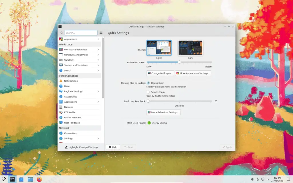
Once installed, you can start tweaking KDE to your liking. I’ll let the screenshots speak for themselves, there’s a lot to tweak.
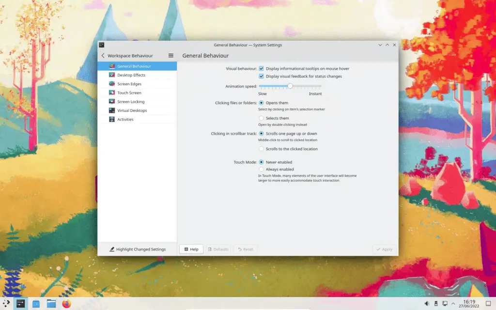
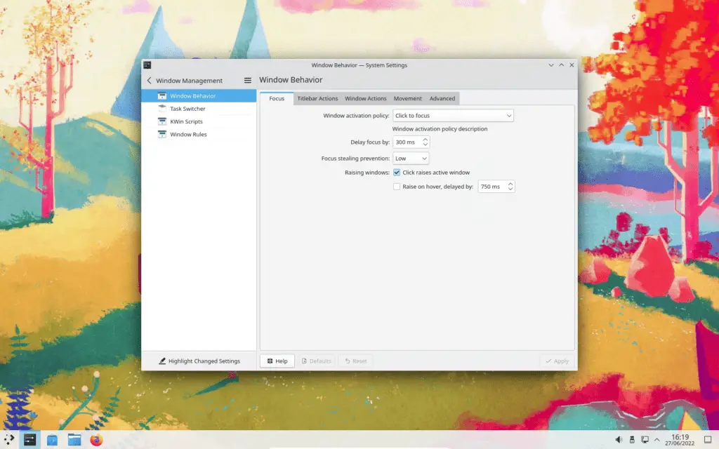
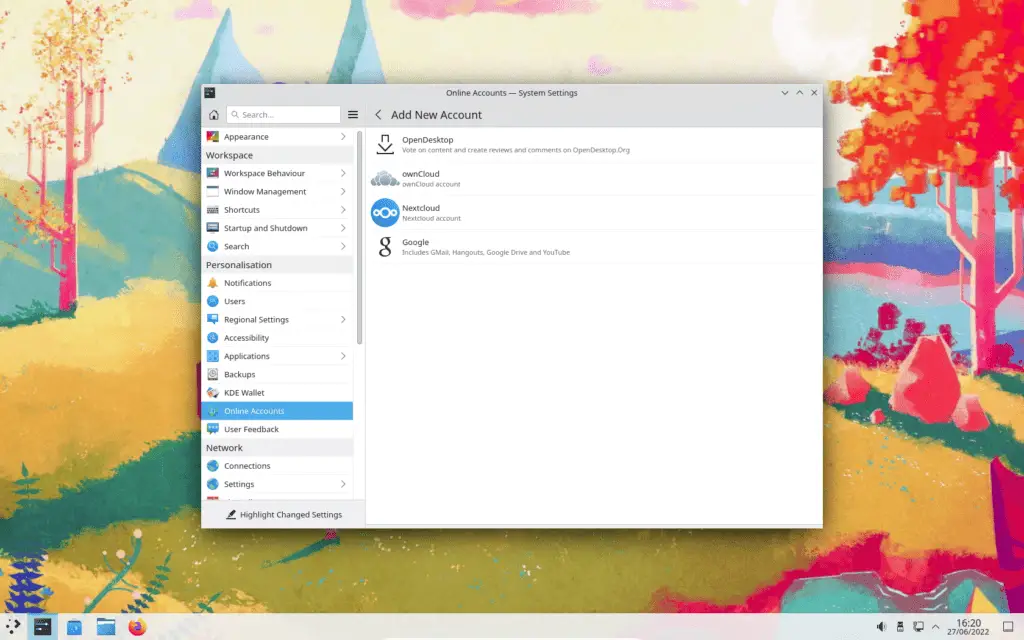
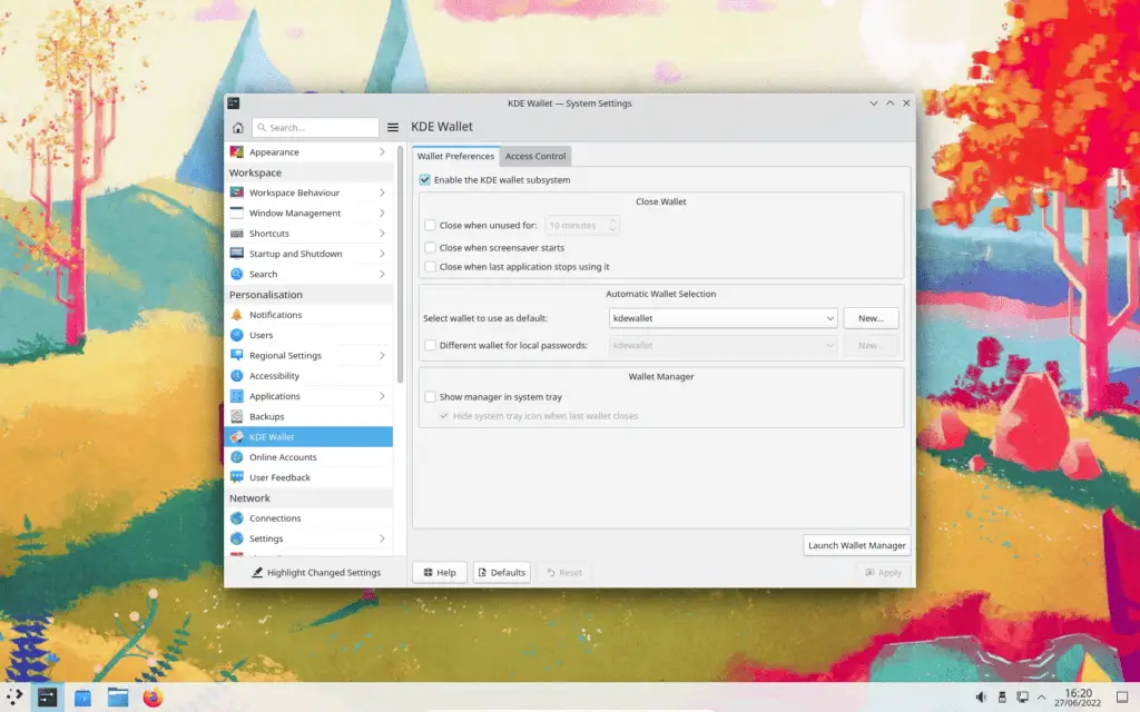
KDE Neon Software
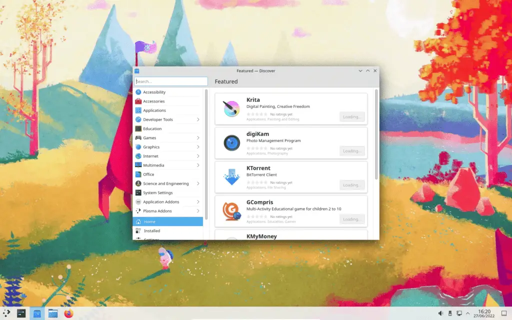
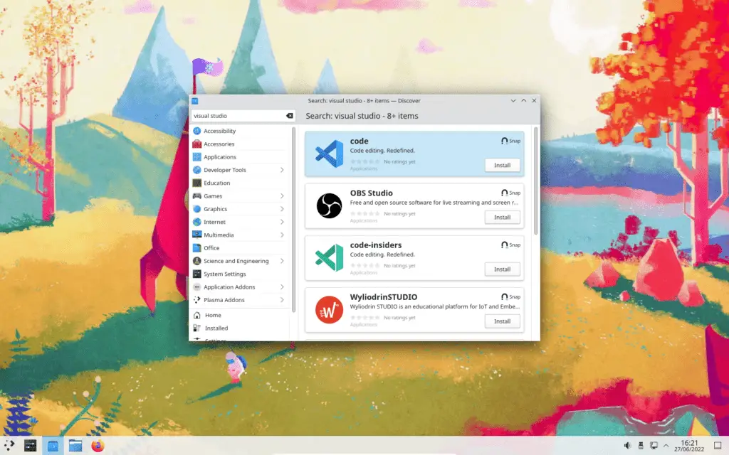
Like most other modern Linux distributions, KDE comes with a software store. It works like pretty much every other Linux software store, and all of the packages you’d expect to find are there – torrent clients, programming IDEs, media players, games, and so on.
Anything that’s not in the store can be manually downloaded and installed, or built from source.
KDE Plasma 5 Desktop Features
KDE Plasma 5 comes with the kitchen sink. It has a lot of built-in functionality. This will annoy minimalists who would consider it a waste of resources being used to provide functionality they may never use, but given we’re in the age of octa-core processors and tens of gigabytes of RAM, I don’t really care. By including additional functionality out-of-the-box, KDE can ensure that the desktop experience is consistent and that all of the included software plays nicely with each other.
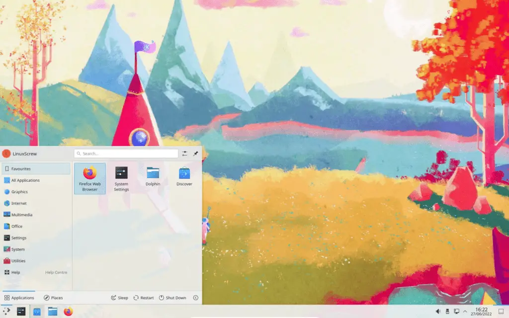
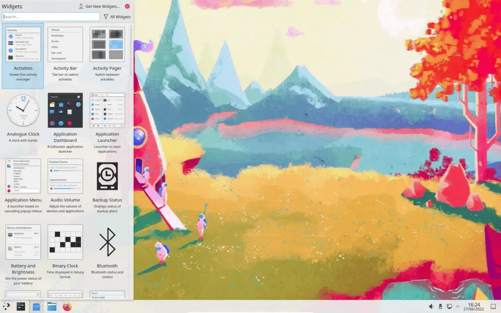
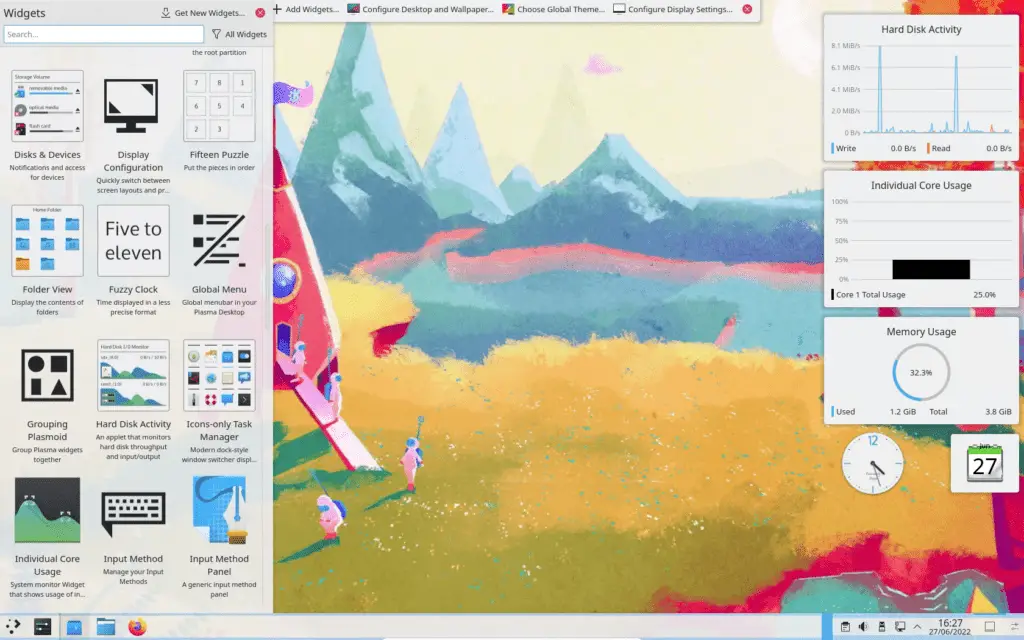
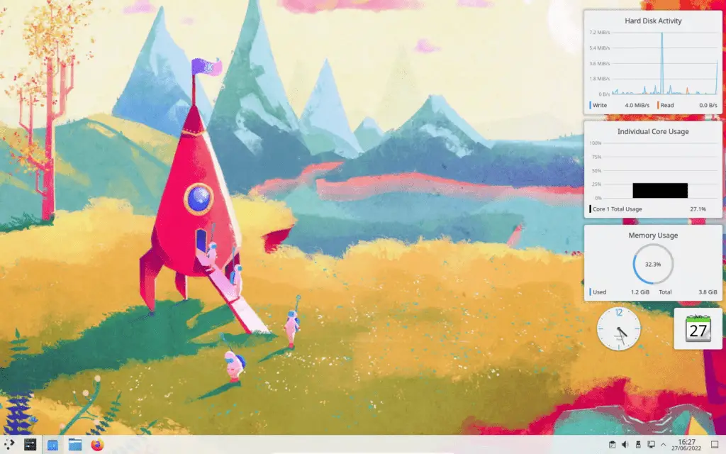
KDE Usability
Overall, I found KDE’s desktop environment easy to use. The familiar layout is especially good for those coming from Windows – the start menu and window control buttons are all in the same position by default as they are in Windows, and the icons, colour scheme and overall ‘paradigm’ are quite similar.
KDE Neon has so far proven to be a rock-solid OS for my usage. The included software all does what it says on the tin, the OS is responsive and everything ‘just works’ as it should. It’s a complete OS ready for production use.
If you’re not happy with the way KDE does things by default, it’s heavily customisable, so you can tweak away for hours until you have your ideal desktop environment.
Minimalists need not apply, however. KDE is resource intensive, and feature heavy. It is opinionated in some areas, enforcing certain behaviours, so if you’re looking for something lightweight that gives you 100% control of your desktop experience, you may be better off using a scriptable, customisable window manager like FVWM2 or awesomewm.
Final Thoughts – KDE vs Gnome vs MATE
As I mentioned earlier, I’ve found the more recent versions of the GNOME desktop frustrating to use. I find the customisation limited, the placement of screen elements inconsistent, and use of screen space inefficient.
Because of this I’ve mostly been sticking to Linux Mint’s MATE and XFCE distributions recently. These are lightweight GUIs that are snappier and easier to use, but they do have their problems – mostly with configuration and integration with other software.
While KDE Plasma 5 is far from being lightweight, it is nimble when paired with powerful hardware, and it provides a full out-of-the-box desktop experience that takes no configuration to get up and running, while giving you a huge number of customisations to play with.
That’s just me though. I’m quite lazy when it comes to setting up my systems – I just want to install something that works straight away and that doesn’t invove me having to configure or install UI packages, or re-learn where anything is (especially those muscle-memory things like where the main application menu is located). Being able to tweak the behaviour later on if I do start to find that the GUI is getting in the way is a bonus.
We’re spoiled for choice, so take advantage of it – Explore a few Linux distros and desktop environments and find what’s right for you!

